Showing posts with label Art. Show all posts

Wednesday, January 2, 2019

Reconciliations

Unraveled: Life Under the Seige

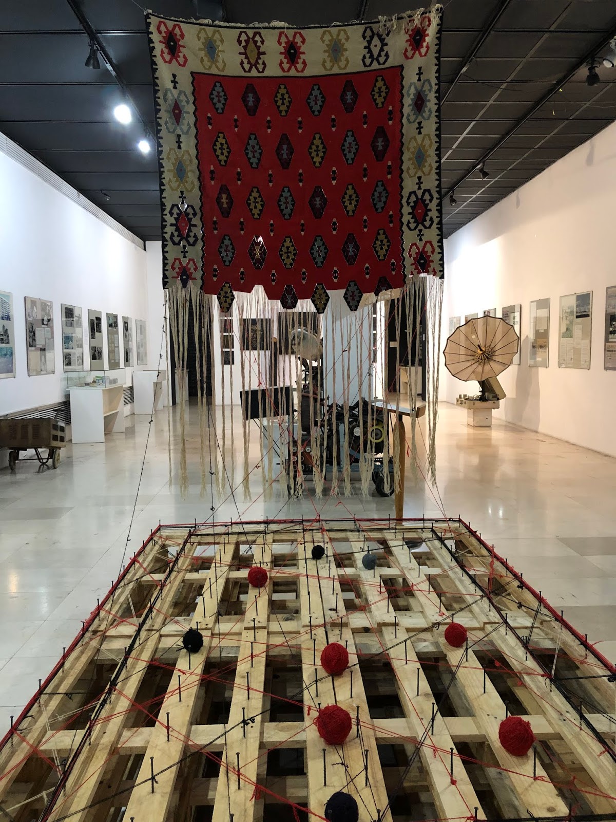
The impetus for our trip to Sarajevo was friend Selma's installation in an exhibit, Reconciliations, which opened on November 26, 2018. A Sarajevo native who went through the Bosnian War, 1992-1995, she suffered the loss of her father, endured sniper fire and shelling, then escaped the city a couple of years into the war. Her teenage journal entries during the siege are gripping, poignant and heartrending.


Bosnia's artistic heritage includes the art of carpet weaving. The unraveling of this carpet demonstrates the lives of war-trapped citizens. All of the tradition and predictability of their lives has come apart. An article in WeTvArabia says:

Reflecting on this unraveling of her pre-war life and the reconstruction of life after the war, the artist has created a powerful installation of a traditional carpet, suspended from the ceiling, unraveling before the audience’s eyes. The unraveled threads are wound around nails on a wood platform, representing interconnections and voices of memory, both literal and phenomenal.

Here is how Selma explained her installation to the interviewer:
“When conflicts escalate into wars, and the wars go on for years and eventually end, the immediate post-war reconstruction takes over. Schools, hospitals and homes are repaired, usually to their original condition, masking any signs or traces of the disastrous events, sadness and human struggle. Is it possible to re-condition something (building, space, soul) to be the same, to feel the same, when it had been wounded, destroyed and deeply scared on the inside? Is there a clear boundary between lives and spaces before the war, under the siege and of the aftermath?” Ćatović Hughes said.

More from WeTv:
The intent of this art installation is to show the intricacy of the impact of the war circumstances not only have on one person, but rather on an assembly of lives that come together as one whole. Celebrating Bosnian cultural heritage of carpet weaving, the threads become the voices of memory. The process of weaving combines numerous pieces carefully constructed into a cohesive and unified composition, the whole. To create a woven piece like a carpet, it takes time, ritualistic order, repetition and predetermined idea of an outcome.

Selma:
“When the unraveling begins, it is undoing everything the long process of weaving had accomplished but at much faster pace. The threads separate, shapes dissolve and become illegible new forms, and colors bleed independently upon the taut white vertical threads as a ghost background,” Ćatović Hughes said.

Read more about this here


It was a privilege to spend several days in Sarajevo, and to see this exhibit, which included other artistic interpretations of the war experience.  One was a series of photographs depicting a small boy whose young life was restricted because of the violence. That boy's life was finally ended by a sniper's bullet.

Another artist set up a room showing how people lived to avoid shelling and sniper fire, and there were relics from the war years that demonstrated the hardships endured by the citizens of Sarajevo, an Olympic city.


Saturday, November 26, 2016

Artsy Finland

 I saw many pretty things in and near Turku Finland this summer


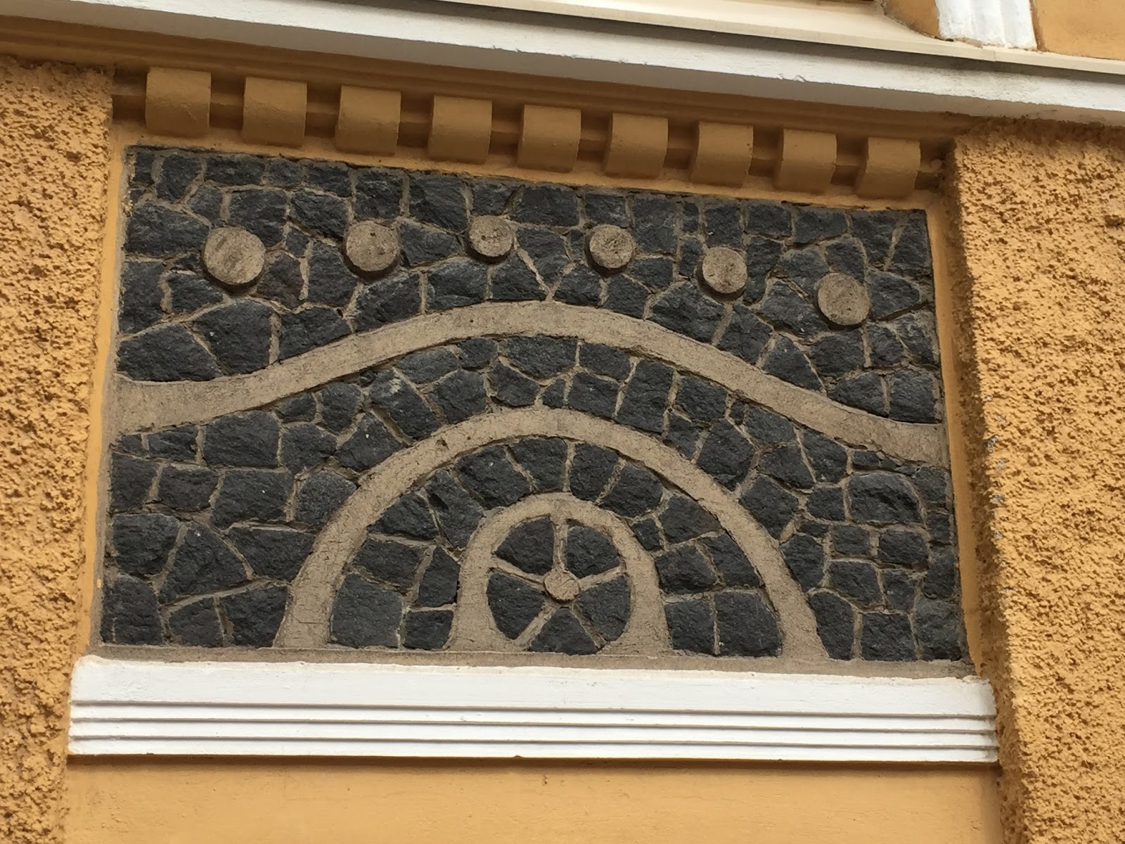
I want to comment on this one. The photo was taken at a lace museum in Rauma, about an hour north of Turku. For hundreds of years the city has been known for its fine lace-making. An interesting bonus is the woman who cuts my hair here in Oregon is from Rauma. Her mother was visiting Oregon from Rauma recently, and we talked about my visit to Rauma (with her daughter translating). Next time I go to Rauma, she's going to give me the VIP tour!

Wednesday, November 13, 2013

The Fine Art of License Plates

Last week I wrote about picturesque state flags.  My husband suggested a blog about license plates.

Plates have come a long way since this typical 1960s example:


Well, EXCEPT for Virginia.  Here's their current plate:

Plates are free billboards to advertise the magical bounty of a state. I'm pretty sure Virginia has history and beauty that should be on their plate. Even if they don't, they could at the very least follow Montana's example of putting their state outline for all to see (dull as it is):

Or they could do as New York and a few others do: add a teeny tiny outline of their state. Well, maybe not. That messy inkblot would never inspire a person to say, "Hey I absolutely must visit New York!"


Now for the best plates.  Hard choices . . . out of 50 state plates I would say over half of them are scenic tableaus that attractively encourage us to visit their state.

easy on the eyes, dreamy beautiful colors

you can count on Wyoming for a dynamic plate--they've featured the cowboy on his spirited bronc since time began

a little busy with the 50th seal, but towering snow-clad mountains and long-light days says: Alaska!

two colors, one graphic--Rhode Island's perky plate lets us know it is all about the sea

one of the famed arches of Southern Utah--plates never lie--Utah is a spectacular stunning state

you can almost inhale the freshness of Maine's fragrant pine forests and sweet meadows

as with their state flag, New Mexico has gone simple . . . and effective


Here's two plates with a little history:

New Hampshire's famous symbol, The Old Man of the Mountain, appears on its state quarter, license plate, route signs, etc. The mountain collapsed suddenly in 2003, devastating the folks of NH. It would be like Utah's arches crashing down, or Maine's forests burning up.

And, Oregon, My Oregon:
Not a bad plate, now. When it first came out 20-some years ago you could have heard the outcry from the bottom of Hell's Canyon.* The tree was a languid lime green, the mountains were a pale lavender-gray, and the sky was a smoggy brown.  Brown sky??  Yeah. The state didn't react fast enough to the criticism, and people took the law--and colored sharpies--into their own hands to brighten and true up the colors. The state fixed the palette. We're sort of happy with it now.


*a spectacular mile-deep canyon in NE Oregon


Friday, November 1, 2013

Coolest State Flags

I declare the most attractive and effective flags to be the colorful and simple. When a banner is flown high up on a pole, tiny figures, words, and scenery drawn seemingly with a number 2 pencil are completely lost to our sight. At worst they look like aberrations in the fabric. In my opinion the flags pictured here make the boldest proclamations about their states. They are simple, striking, and convey a symbolic message and enthusiasm for their state:


Arizona--Don't you get a yearn for Arizona when you see their flag?  The warm sunny colors convey the wide open desert, the blue reminds us of the mountains and cooler areas. The star mimics a setting sun and the whole thing emanates a wild west feel.


Alaska--"The simple flag of the last frontier."   The Alaska flag goes together with the state song. "Eight stars of gold on a field of blue . . . The blue of the sea, the evening sky, the bear, the dipper, and shining bright: the great north star with it's steady light, o'er land and sea, a beacon bright . . . " which by the way, beats Oregon's languid state song by a mile. The long nights way up north give the stars greater prominence than we enjoy in the lower 48. And again, less is more.

Alaska State Song


California--My all-time favorite flag!  The grizzly says it all.  California was a wild place back in the day. The last grizzly in Southern Cal was killed in 1879 just a few miles from where I grew up (I have no memory of that event . . .). The flag was raised at Sonoma in 1846, declaring California separate from Mexico as The Bear Flag Republic. A two-year war occurred to make that a reality and voila, California became the 35th US state.


Montana--This is an exception to the rule that flags should not sport intricate pictures that are impossible to see from a distance. The bright colors and relative simplicity of the tableau makes it easy on the eyes. Love the Bitterroots and the Great Falls of the Missouri in the sketch.


New Mexico--Another flag from a sunny state that found a unique way to represent the sun, using a native American symbol. The colors represent the original Spanish explorers and settlement. New Mexico's heritage is displayed using only two colors and one symbol. Amazing.


Oklahoma--The shield of the Osage warrior bedecked with a peace pipe, an olive branch, and eagle feathers pays homage to Oklahoma's heavy native American beginnings. Set on a stunning blue background, there is no other flag like it.


Texas--Nothing says "the Lone Star State" like . . . a lone star on their flag. Dating from the days of independent Texas, the flag was Texas's symbol on becoming a state in 1845. The lone star represents solidarity in standing up against Mexico.


Washington--Old white guys glorified on a state flag don't usually cut it, but this vibrant flag honoring ol' George is pretty as a picture. The deep emerald green signifies Washington's predominant color, and, balanced out by the yellow of eastern Washington wheat fields, and azure blue reminding of us sea and sound, is stunning.


And now, the worst: There is not a duller state flag anywhere, than that from my home state. Even if you magnify the seal, it's not easy to see what is portrayed (if I squint a Conestoga wagon pops up and maybe a clipper ship . . .).  And 20 feet up on a flag pole, forget it. The beaver on the backside is a nice touch, but flown up the pole, you would swear someone spilled a jar of mustard on the flag.  About five years ago The Oregonian newspaper solicited designs for a new state flag, but the legislature did not get on board, and now that issue is dead in the water. Yeah, about as dead as our dull state flag.


Monday, November 5, 2012

If I Imbibed. . .

I am not now, have never been, and never will be, a consumer of alcohol. But if I were, surely I would be swayed by the picturesque, beautiful boxes the stuff comes in. If you ever see me lingering in the liquor aisle at Fred's, I'm not contemplating a life-style change, I just can't look away from the striking art on the beer/ale cartons. (Question: are beer and ale the same thing?). Take the tour!

First, the seasonal:

Rogue (Dead Guy Ale!) did not appear at Winco until just before Halloween; do ales and other alcohol have seasonal versions, or at least seasonal containers?? 


What a pretty box.  I would buy Pumpkin Ale to serve in October and November.

Angry Orchard should be served on a dark and stormy night. Reading Dracula or Rebecca would be appropriate.

Another tree theme, this one wine.  A companion to Something Wicked This Way Comes, Helter Skelter or, break out your Steven King collection.


Christmas is just around the corner. Pick up some holiday-appropriate ale along w/ your gifts.


How about some stunning scenery with your beer / ale??

 The Donner Party camped by this lovely lake and mountains, but I doubt they enjoyed it much.


A Pacific Northwest view.


Black Butte is a favorite vacation spot of many Portlanders.  It looks just like this:

I have lived in a place (Boise) that had an inversion problem and it's not pleasant, so why would they name a beer that?


These retro designs send me right back into the 50s and 60s:

Longboard is from Hawaii, but the scene reminds me of Malibu Beach.  Remember that movie, The Endless Summer?  

Who doesn't love the old song? 

A creative display of beverages in front of the Great Pyramids in a Garden of Eden setting.


Fat Tire takes me back to childhood. Sadly, my bike was not this cool.

Another bicycle theme, another Deschutes Brewery (located a few hours away in Bend Oregon).

The Patriotic:
This one I am familiar with. Portland's mayor is Sam(uel) Adams. When he was running for office he received a letter from a lawyer for Boston Beer Company asking him to  give up his Sam Adams websites, as they felt it infringed on their company.  His reply: "They say they've been using this trademark since 1984 . . . I've been using it since 1963."

Wildlife:

The very cool abstract kangaroo.  A Town Like Alice?

Bridgeport Brewery is located in NW Portland and uses the St. Johns Bridge on their logo. A few times I've smelled crafted beer in the air downtown, perhaps from Bridgeport or from Henry Weinhards.

Also by Bridgeport, and I give this one FIRST PLACE for a creative and an intriguing pretty picture (plus I may be related to the dude).  Sit down with Anna Karenina:

Odds and ends:

Widmer's is not artsy like the above, but gives a smart and clean impression. It's like beer wearing a suit.


Psychedelically pretty.  Read The Electric Kool Aid Acid Test.


The weird:
No words.